What Trending Colours Reveal About Today’s Socio-Economic Landscape
Butter yellow is replacing beige as the cultural and emotional neutral of 2025. Explore how this trending colour reflects post-recession optimism, consumer sentiment, and brand strategy opportunities across fashion, interiors, and lifestyle.
July 21, 2025
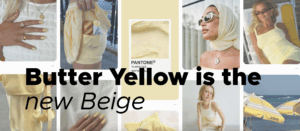
By all appearances, butter yellow – a soft, creamy hue once relegated to the background of 1950s kitchens – has emerged as a dominant aesthetic force across fashion, interiors, and consumer branding. But for marketers and brand strategists, butter yellow is more than a trending shade. It’s a socio-economic signal: a mood board of consumer sentiment during a moment defined by cautious optimism and emotional recalibration.
From Beige to Butter: A Shift in Mood and Meaning
For the past decade, beige reigned supreme. It aligned with the values of “quiet luxury” and minimalism – its neutrality providing visual relief in an overstimulated, anxious age. It also reflected economic caution, with its understated-ness appealing during periods of market volatility and cultural restraint (Medium, 2024).
Now, butter yellow is replacing it. Like beige, it’s non-invasive and versatile – but unlike beige, it carries warmth, nostalgia, and an unmistakable emotional lift. It retains neutrality while projecting optimism.
According to trend forecasters and fashion analysts, the transition from beige to butter yellow mirrors a post-pandemic cultural desire to reconnect with softness, familiarity, and hope. In psychological terms, yellow is associated with energy and clarity – but its buttered variation is far gentler, hinting at comfort rather than command.
Colour as a Socio-Economic Barometer
Colour theory and economic behavior have long been intertwined. During periods of economic downturn, consumers gravitatetoward darker, more practical hues – navy, brown, charcoal, taupe – seen as timeless and value-protective investments. This phenomenon, sometimes dubbed the “recession brown effect,” was documented during the Great Recession and again during the early 2020s pandemic era (The White Rabbits, 2023). “Mocha Mousse” (PANTONE 17-1230), the Pantone Colour of the Year, shows we haven’t quite moved away from it yet. This warm, rich brown is a soft and inviting hue, bringing to mind the comforting and indulgent qualities of cocoa, chocolate, and coffee, enhancing the sensory marketing phenomenon, viewed as equally trendy.
Nevertheless, Butter yellow signals a tentative move away from recessionary conservatism toward hopeful renewal – not quite exuberant, but undeniably lighter. In this way, it embodies a “soft landing” for consumer emotion. This interpretation is supported by its rise not only in fashion, but also in home decor, kitchen appliances, and accessories – domains where consumers seek emotional safety and visual affirmation.
Cultural Resonance: Nostalgia and Domestic Reimagining
Butter yellow taps into more than economic sentiment – it hits emotional memory. Its roots in mid-century design link it to 1950s post-war optimism and domestic comfort. In an age of rising AI anxiety and social disconnection, such retro tones restore a sense of tactility and innocence (The Spruce, 2025).
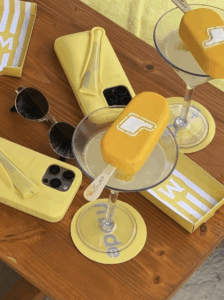
Brands are leveraging this effectively. KitchenAid’s choice of butter yellow as their 2025 Colour of the Year signaled a broader embrace of cheerful domesticity (KitchenAid, 2025). Likewise, fashion houses like Chanel, Gucci, and Toteme integrated the tone into their Spring/Summer 2025 collections, framing it as both “classic” and “forward-thinking” (Vogue, 2025).
Even celebrity styling underscores this cultural pivot. Oprah Winfrey, Kate Moss, and Timothée Chalamet have all embraced butter yellow in recent appearances, using the hue to convey calm, charisma, and emotional approachability. The colour is also gaining traction across social fashion trends, particularly on Pinterest, where curated boards offer inspiration that encourages personal adoption.
This collective embrace fosters a sense of emotional connection and community, highlighting how colour theory can become a shared language of aesthetic and sentiment.
Who Wears Butter Yellow – and Why
The rise of butter yellow also tells us who’s claiming space in cultural narratives.
- Millennials and Gen Xers use it as a nostalgic anchor – styling it with denim, earth tones, and minimalist silhouettes that reflect pragmatism with warmth.
- Gen Z is incorporating it into coquette, fairy-core, and soft academia subcultures, favoring pastel tones that speak to emotional softness and escapism.
- Luxury and celebrity markets are using it to temper high fashion with a touch of humanity – replacing austere beige with an approachable charm.
Butter yellow is a visual cue of identity: its wearers signal emotional intelligence, aesthetic calm, and quiet optimism.
Brand Strategy Implications
For marketers and brand leaders, understanding the cultural function of butter yellow offers actionable insight:
-
- It’s not just trendy – it responds to consumer sentiment. Use this in copywriting, lookbooks, and digital campaigns.
- Bridge lifestyle categories. Its adoption across homeware, fashion, and wellness products suggests room for cross-category alignment.
- Butter yellow allows for retro storytelling – perfect for campaigns that blend heritage and nostalgia with modernity.
- Use colour to signify tonal shifts in brand voice. Swapping beige for butter yellow in packaging, UX design, or editorial layouts can signal subtle evolution or audience curation – from distant minimalism to friendly sophistication, from millennial to Gen Z.
Final Thoughts
Butter yellow’s rise reflects a broader shift in cultural tempo. We’re not in full celebration mode – but we are looking for light. This soft, optimistic tone marks a transitional moment: from caution to calm, from austerity to assurance.
For brands and marketers, this isn’t about chasing a colour trend – it’s about understanding what the colour stands for. Butter yellow is the visual language of quiet confidence. And in 2025, that may be the most powerful message of all.
Latest News ☕
The evolution of social media: How early platforms shaped today’s digital landscape
February 28, 2026
Tumblr walked so Pinterest could run - and so did more platforms. We identified the early ...
Which paid amplification strategy actually works in 2026?
February 26, 2026
Influencer whitelisting and TikTok Spark Ads both transform creator content into paid adv...

When user-generated content stops feeling authentic – and what to do instead
February 21, 2026
The polished "casual" aesthetic of branded user-generated content has become so ubiquitous...