Why 2026’s color trends signal a strategic shift for brand marketing
Pinterest's 2026 Palette, released January 2026, identifies five trending colors based on 24 months of search and save data from the platform.
January 17, 2026

Color selection has evolved beyond aesthetic preference into strategic business intelligence. As major platforms like Pinterest analyze millions of user interactions and Pantone announces its annual direction, brands face competing visions for visual identity in 2026 – and the choices they make will directly impact campaign performance and audience engagement.
The forecast includes
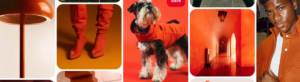
Persimmon (#FF5C34) a vibrant red-orange *Marty Supreme cough, cough*
Cool Blue (#D7EFFF) a glacial pale blue,

Jade (#AEB8A0) a muted green between mint and moss,

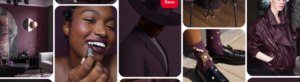
Plum Noir (#351E28), a deep purple with burgundy undertones,
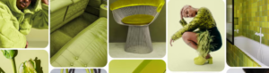
Wasabi (#E9F056), an electric chartreuse yellow-green.
The data reveals significant behavioral shifts. Searches for “persimmon aesthetic” increased 100%, while saves grew 55%. Cool Blue saw searches rise 85% with saves jumping 215%. Plum Noir searches for “dark plum” climbed 220%, with overall saves increasing 335% – making it the fastest-rising shade in the palette.
Meanwhile, Pantone selected Cloud Dancer (11-4201) as its 2026 Color of the Year, a soft off-white intended to convey calm, clarity, and visual simplicity. The choice has sparked debate within the marketing community, with critics calling it underwhelming and overly safe.

The strategic divide: Bold expression versus minimalist restraint
The contrast between Pinterest’s bold, saturated palette and Pantone’s neutral selection reflects deeper tensions in consumer preferences. Pinterest’s methodology – tracking actual user behavior through searches and saves – suggests audiences are gravitating toward “bold, imaginative detours” that spark emotion and offer escape. According to Pinterest’s analysis, consumers want “color with emotional utility” that helps them feel grounded while staying optimistic.
Pantone’s Cloud Dancer, by contrast, positions itself as a response to ambient chaos and sensory overload given the socio-economical and political status quo and tech-development. Color theory and economic behavior have long been intertwined. The shade functions as both baseline and reset button, offering breathing room in increasingly cluttered visual environments. However, industry experts note that white already dominates retail across home interiors, apparel basics, and packaging design, raising questions about whether the selection drives trends or simply confirms existing patterns.
Platform-native color strategies drive discovery and engagement
For brands operating in social-first environments, color selection directly impacts content discoverability. Pinterest’s algorithm likely favors content featuring trending colors, meaning strategic adoption of these hues could enhance visibility in search results and recommendation feeds. Research suggests brands that incorporate trending colors into marketing materials can see up to 50% higher engagement rates compared to those using outdated color schemes.
The Pinterest Palette provides practical applications across multiple touchpoints. Persimmon’s cultural momentum – evidenced by its prominence in Milan Fashion Week Spring/Summer 2026 collections and celebrity marketing campaigns – makes it particularly effective for fashion, beauty, and lifestyle brands seeking to signal energy and optimism. Cool Blue’s 215% increase in saves positions it as ideal for wellness, interior design, and technology brands emphasizing calm and restoration.
Jade’s muted green reflects biophilic design principles that blur boundaries between indoor and outdoor living, aligning with sustainability messaging that resonates with younger demographics. Plum Noir taps into “moody maximalism” while carrying nostalgic qualities that defined ’90s interiors. Wasabi’s electric yellow-green offers an updated take on viral neon trends, providing standout potential without the overwhelming fluorescence of earlier chartreuse moments.
Adapting color intelligence without compromising brand identity
The key challenge for brands lies in incorporating trend intelligence without diluting established visual identity. Strategic color adoption works best when applied to specific campaign elements – seasonal promotions, product launches, or social content – while maintaining core brand palette integrity.
Successful implementation follows a measured approach: test trending colors in social media content first, analyze engagement and conversion data, then expand to broader marketing channels based on performance. This allows brands to capture trend momentum while preserving the consistency that builds long-term recognition and trust.
For brands with established color palettes, trending shades can function as accent colors that signal cultural awareness without requiring complete visual overhauls. Temporary color additions for holidays or special campaigns keep core palettes intact while demonstrating responsiveness to evolving consumer preferences.
The cost of ignoring behavioral color data
Brands that dismiss color trend forecasts as superficial aesthetic exercises miss the underlying behavioral intelligence these reports provide. Pinterest’s methodology tracks actual intent – what consumers actively search for and save for future reference – making it a predictive tool rather than reactive commentary.
In increasingly saturated digital environments where attention spans measure in seconds, color serves as one of the fastest signals of taste, relevance, and cultural positioning. Brands using colors that feel dated or disconnected from current visual culture risk being overlooked entirely, particularly by younger demographics who have grown up with platform-native visual literacy.
The divergence between bold, expressive colors and minimalist neutrals in 2026 forecasts doesn’t represent competing futures – it represents market segmentation. Brands targeting younger, digitally native audiences benefit from Pinterest’s data-driven palette, while those emphasizing timelessness and premium positioning may find Cloud Dancer’s restraint more strategically aligned.
What’s non-negotiable is the strategic application of color intelligence to guide visual decision-making. Whether adopting bold Persimmon or subtle Cool Blue, successful brands in 2026 will be those that understand color as a business tool that drives measurable engagement, shapes perception, and ultimately influences purchase decisions.
Latest News ☕
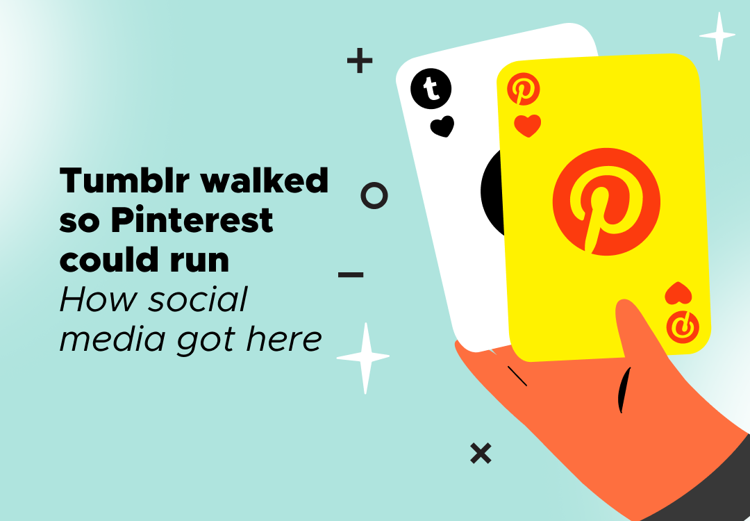
The evolution of social media: How early platforms shaped today’s digital landscape
February 28, 2026
Tumblr walked so Pinterest could run - and so did more platforms. We identified the early ...
Which paid amplification strategy actually works in 2026?
February 26, 2026
Influencer whitelisting and TikTok Spark Ads both transform creator content into paid adv...
When user-generated content stops feeling authentic – and what to do instead
February 21, 2026
The polished "casual" aesthetic of branded user-generated content has become so ubiquitous...